The main goal of any website is to let user browse to the content they are looking for with ease and within less time. If the website has only few pages then it can be relatively easy work. The navigation can show all the pages that can be either placed in header or footer or anywhere in the site that will make more relevance.
But in real world case, any website ranging from medium to large, using or designing navigation can be really tricky. And might need more research, A/B Testing, reading analytics etc. That’s where the clever design and out of box User Experience comes handy.
Personally, being a savvy web developer and SEO Enthusiast, I rate good navigation very highly. Not alone it helps the user to find the pages they are looking for, properly designed navigation can help to list the pages in Google Site Links.
Not to go too far distracted form the topic, I am compiling some of my favourite navigation design. There are so many that can be listed but hereby I am sharing 5 of my best and something that had inspired me in terms of ease to use and simplicity.
Amazon
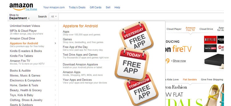
Well its amazon’s navigation I am listing first. One of the website generating highest revenue. I really liked it for simple reasons. It’s so easy to navigate around, and it falls under my design philosophy, simplified designs with minimalistic approach converts well.
EBay
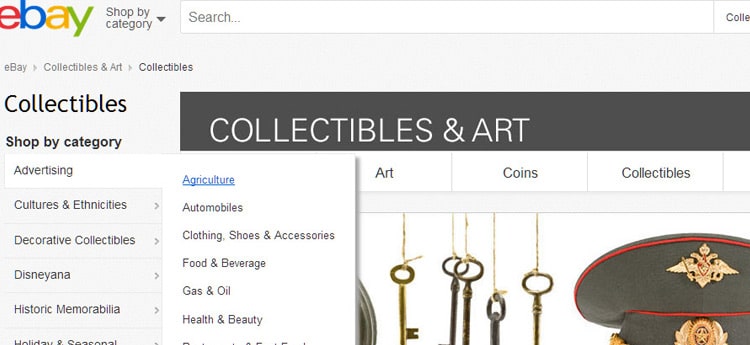
Another website I like in terms of how easy it is to use is Ebay. Pretty sure all of us had at least used ebay to buy something online.
NBA
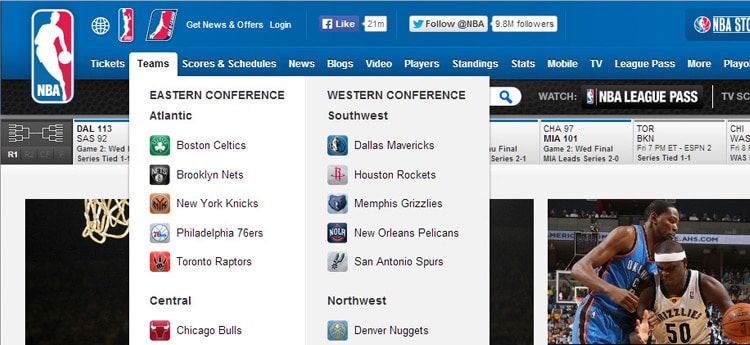
NBA’s website provides information about all the teams in the league. And it’s really important for the site to take to the pages in terms of the visitor’s interest. Drop downs with different categories works well. One of the catchiest part of navigation is the Teams Dropdowns, which shows the list of all the teams.
Arsenal FC
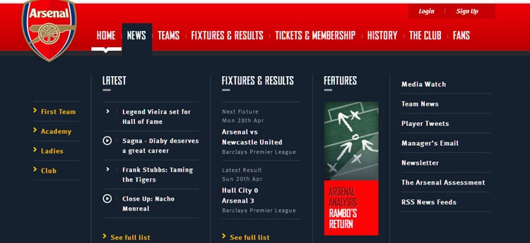
Arsenal FC uses clever mega menus. The menus have main navigation and under hover it shows mega menus as drop downs. Structure and effect of menu helps in finding the content within website way easier.
Toyota Australia
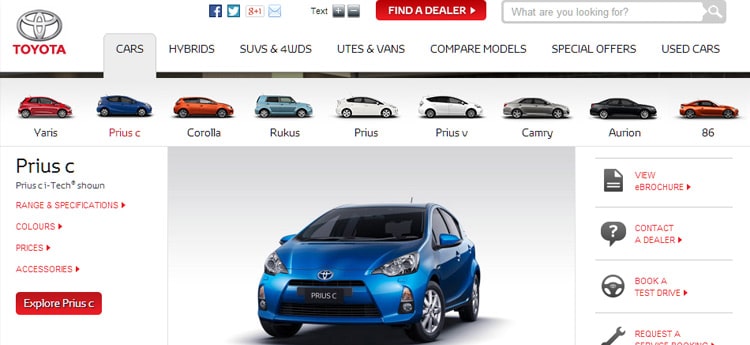
Toyota Australia also use mega menu. The salient feature being its strategy to take the user the page of their interest in a single click. Purely Genius.
On conclusion, all the website listed above are based on how easy I had found them because of how well the navigational menu had been designed. Simplicity prevails and websites design and constructed with User as high priority always performs and converts well.


